Expedia Home Page Redesign
(In-Progress)
Challenge
Expedia needs improvement on the number of booking completion. There’s significant dropping rate from users doing searches before completing the bookings.
< Personal project > As one of the leading online travel booking platforms, Expedia had increased its revenue steadily every year. In a rather competitive market, Expedia is looking for optimization on their website and mobile app that will leads to higher booking completion rate. My role as the product Designer is to find opportunities on their homepage of the website and mobile app that would lead to a smoother and more exciting user experience, therefore to reach the goal of booking completion.
Work
1. User research
2. UI/UX design
Tools
Figma
Illustrator
Photoshop
Solution
Since research takes a chunk of time for users while booking; to make the researching step easy, seamless, transparent, and personalized is the key to make users choose Expedia and to lead to a higher completion rate.
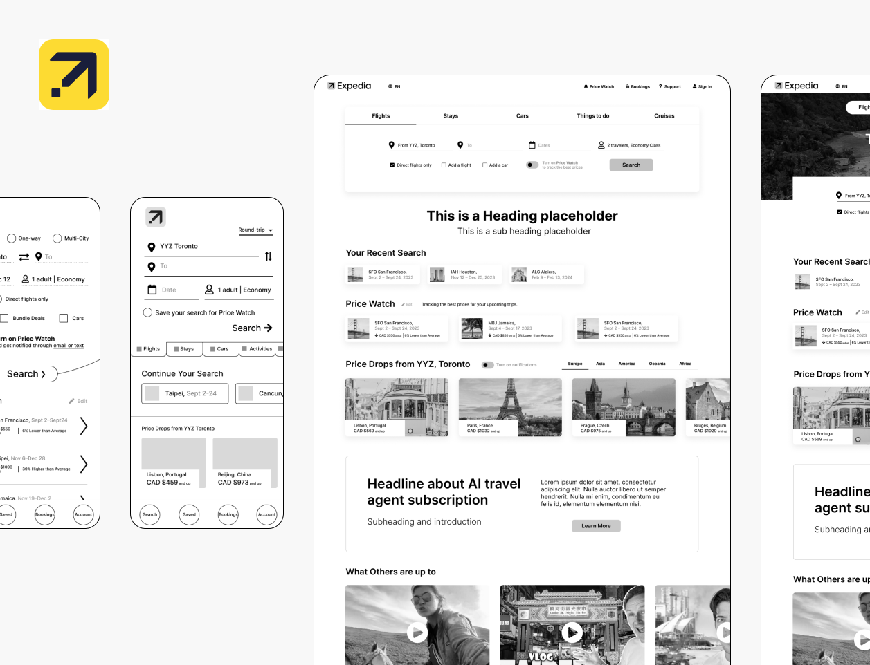
I focus on optimization of the Home page. Some of the main changes include:
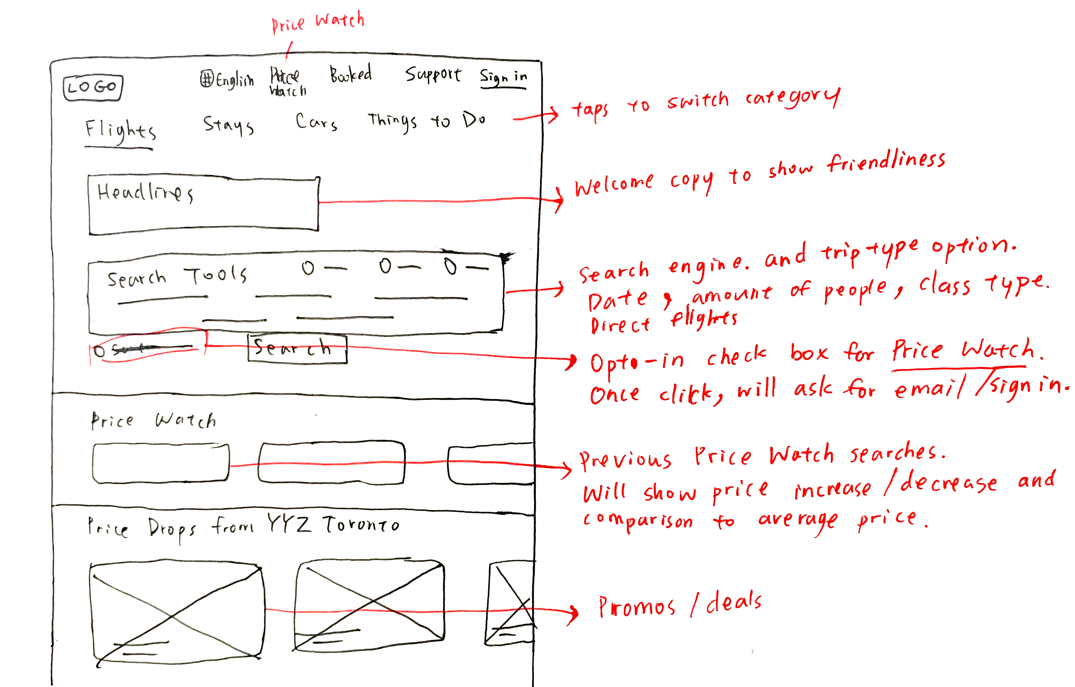
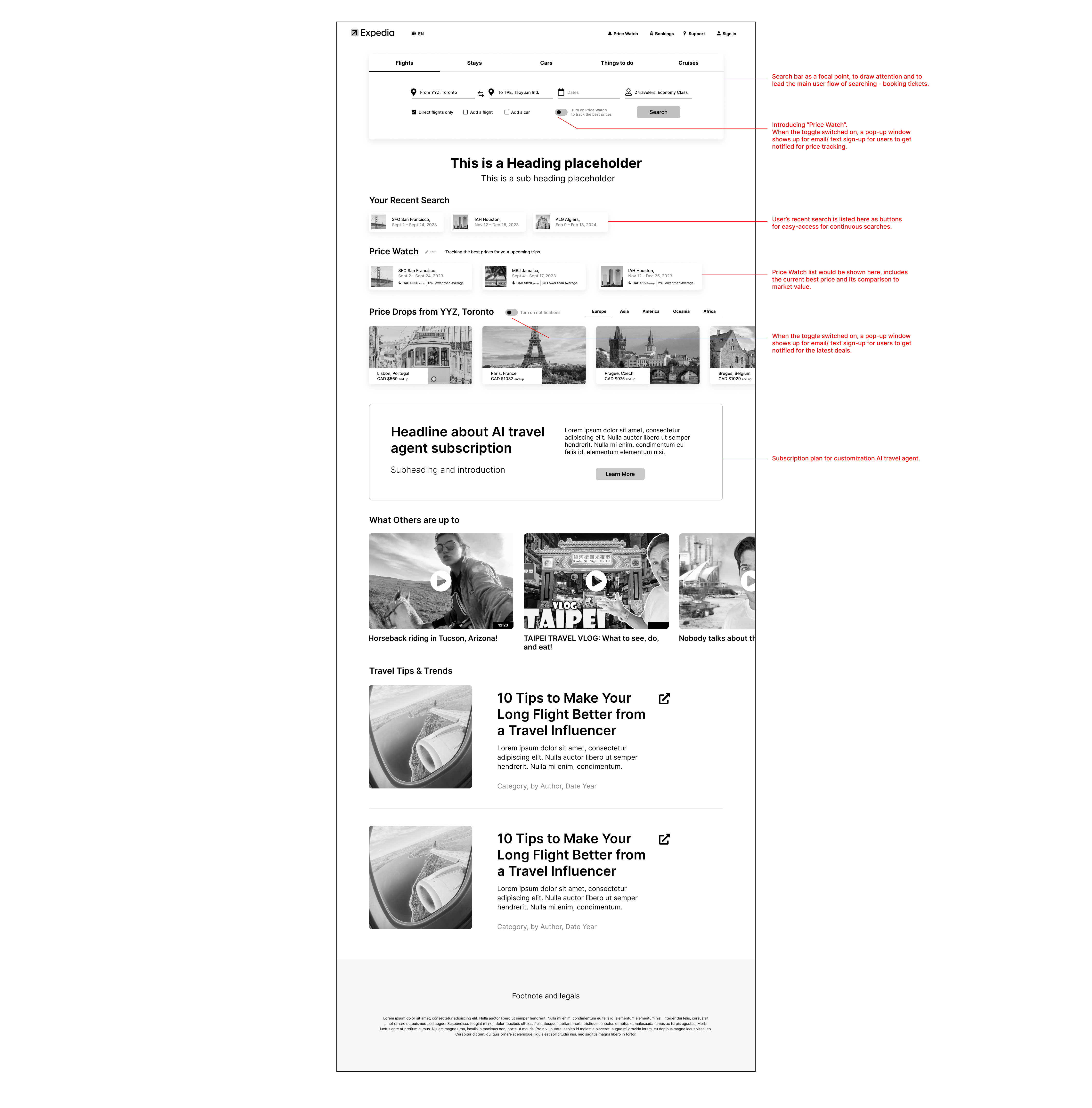
1. Making the main search tool simplier
2. Adding an opt-in "Price Watch" toggle bar that allows users to keep track of the price changes through email notifications
2. Adding an AI assistance service as a paid to subscribe option that customize trips and price watches for the users
3. Adding a section for auto-saved "Price Watch" searches that allow easy acces for the users
4. Cleaning up the interface design for a cleaner, more comprehensible, and easier flow
5. Adding a section "Price Drops" with promos and deals as buttons that allow easy access
6. Adding a section for travel/ vlogging videos from content creators to create excitment and to help trip inspirations
Discover, Define, and Ideate
Research
In order to reach the project goal for more booking completion rate, I conducted some research process to better understanding the users and their painpoints. In hope by finding solutions that could be applied for both the desktop and mobile design.
Research questions
- What stop users stop from completing the booking?
- What makes users complete booking?
- What do the users look for from an online travel agent?
What makes Expedia stand out from its competitors?
What are the market gaps?
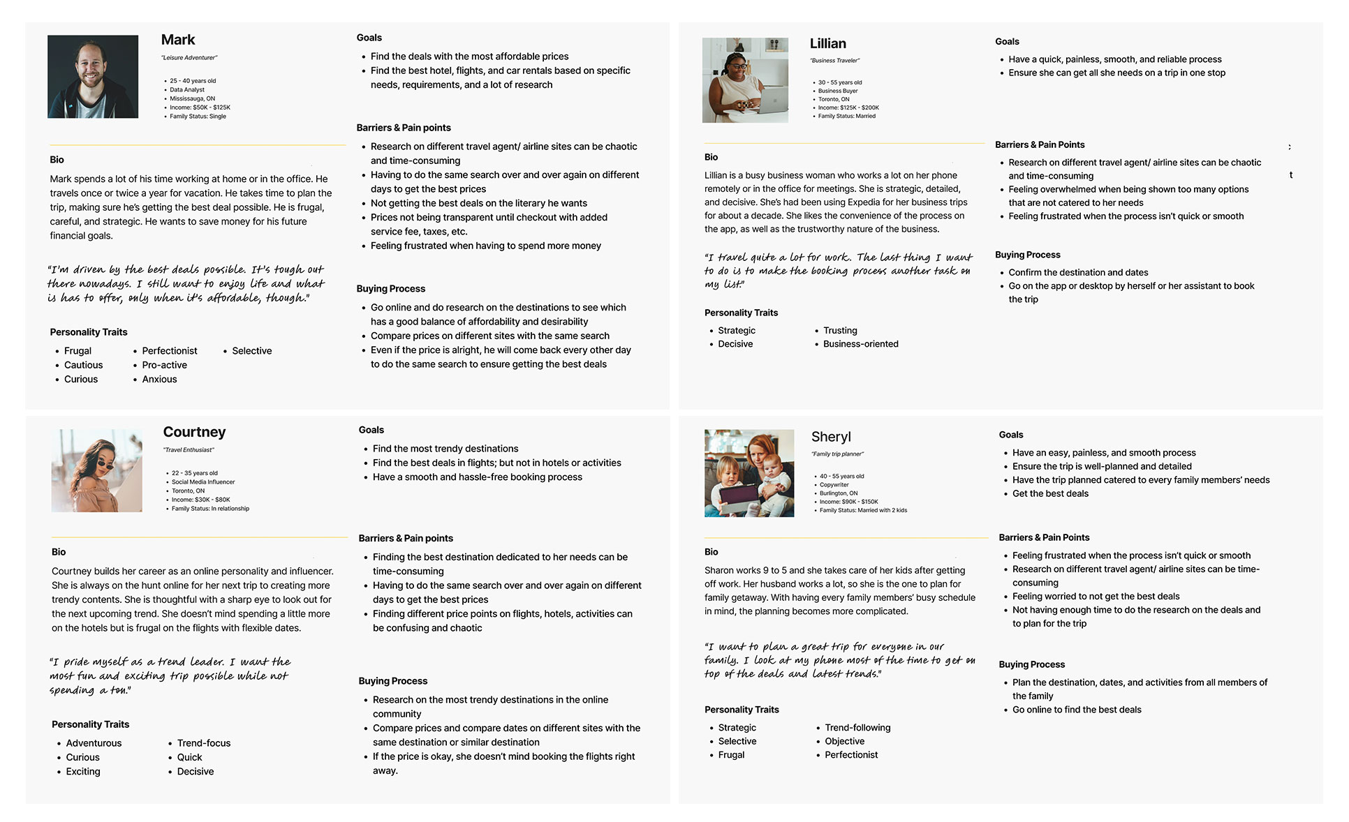
User Personas
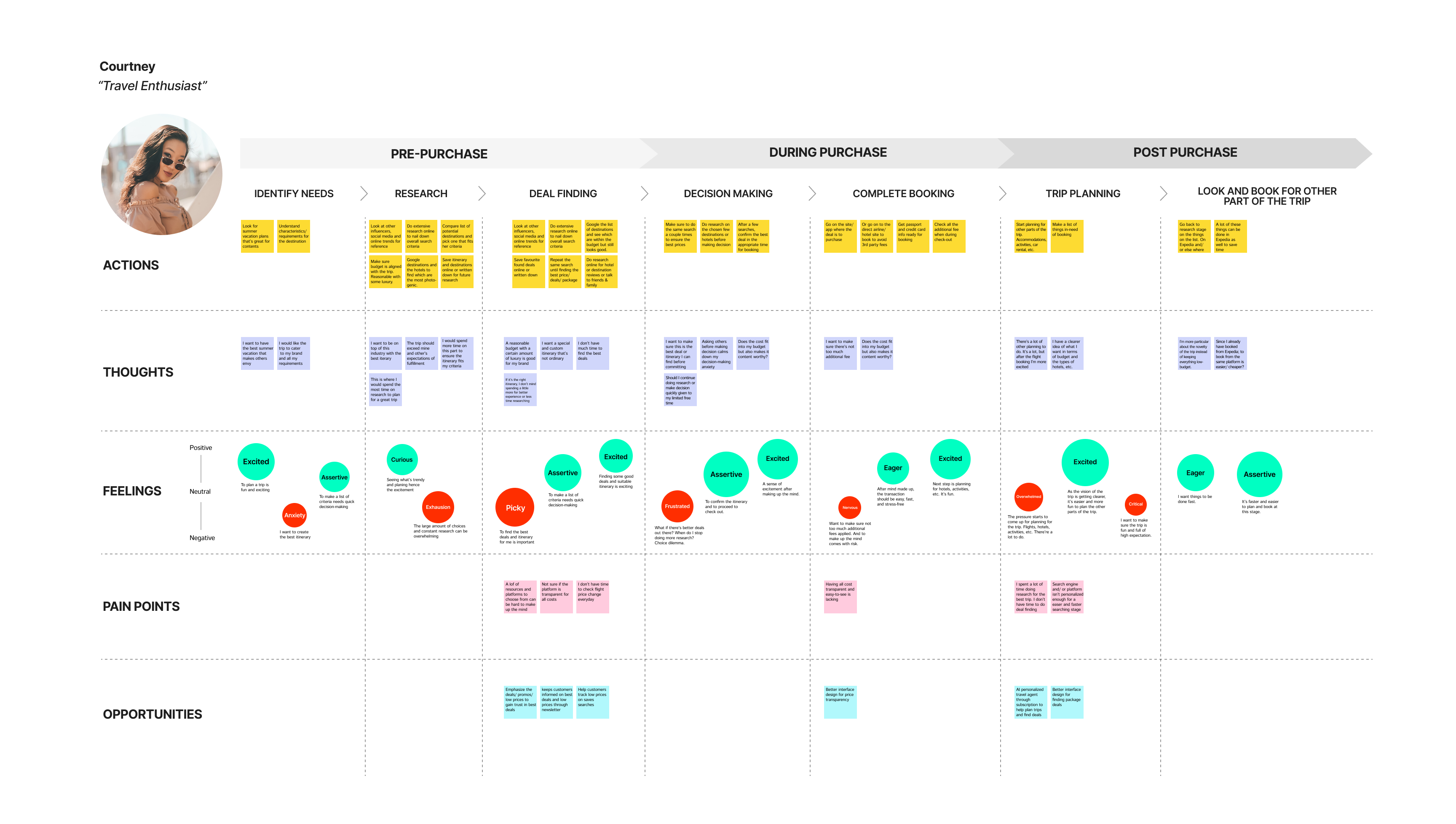
User Journey Map
Conclusion and Takeaways
Summary of the common user pain points
- There's an overwhelming amount of resources and booking platforms make research process long and unenjoyable
- Lack of transparency on fees can make a platform undesireable
- Research on the trip planning takes a big chunk of time
- Research on deals finding is unenjoyable, although essential
- The constant change of flight prices means constant searching on the same flight over a period of time for lower prices
- To make the booking process easy and stress-free is essential for users to select the platform
Literature Research
- 52% of American travelers prioritize the time they devote to travel research over all other factors involved in the booking process.
- In 2022, 64% of those booking online make online purchases on desktop and 44% make them on a mobile device. This shows a shift from 2021, when 59% of bookings were done on desktop and 41% on a mobile device (SalesCycle).
- The percentage of shoppers that abandon their travel purchase is 85% for desktop users and 91% for those buying on a mobile device (SalesCycle).
- 70% of all customers do their research on a mobile device (StratosJets).
- One of the biggest factors hampering travel bookings is the lack of transparency. Comparing too many options is challenging and becomes a roadblock (Travelport).
- Travelers visit 38 sites on average to finalize and book their travel plans (Skift).
- 60% of surveyed travelers believe travel options are filled with hidden costs and are not upfront enough (Travelport).
- 45% of travelers prefer booking a trip from start to finish from a single website that presents options for flights, accommodations, car rentals, and extras (Travelport).
- The factors expected to boost travel intent in the next 12 months include:
- Mobile apps offering on-trip alerts (44%)
- Self-service check-in (41%)
- Contactless payments (41%)
- Flexible cancellations (40%) (Amadeus) - 29% of bookers prefer direct travel reservations for various reasons, including:
- Ask for extra amenities (28%)
- Get the best price (21%)
- Avail of loyalty programs (21%)
- Negotiate better prices (18%)
- Find direct booking benefits (11%) (Hospitalitynet)
Insights Generated
- One of the biggest factors hampering travel bookings is the lack of transparency.
Comparing too many options is challenging and becomes a roadblock. - 45% of travelers prefer booking a trip from start to finish from a single website that presents options for flights, accommodations, car rentals, and extras.
Goal Statements and Solutions
To define a few possible solutions to be applied into the next step: Design and Iterate
To make the researching step easy, seamless, transparent, and personalized is the key to making users choose Expedia.
- Skipping the sign-up step, letting non-users/ guests do search as first step. (Reduce time on research)
Insight: potential customers get discourage from the steps of signing up before looking at deals/ prices. - Create and emphasis “Save Search” as a check box during search and through email sign-up for getting notification for saved trips’ price drop.
- Optimization for Saved searches.
Making the research process smooth and painless. People usually take a few steps of searches first before making the booking. They would save search results for comparison later, usually with results on other competitor sites. - Emphasis on deals & promotions
- Emphasis on price transparency right from the start
- Make it easy to contact Airlines/ Hotels for future change and added-on services.
- Increase booking urgency (callouts on price comparisons at competitors site, callouts on price average in historical times)
- Sleek and modern user interface design
- Minimize design clutters and unnecessary elements.
- Focus on ONE user flow – which is to lead users to booking.
- Clean and modern look and feel.
- Make it FUN and exciting. - Personalized AI travel agent subscription
Design and Iterate
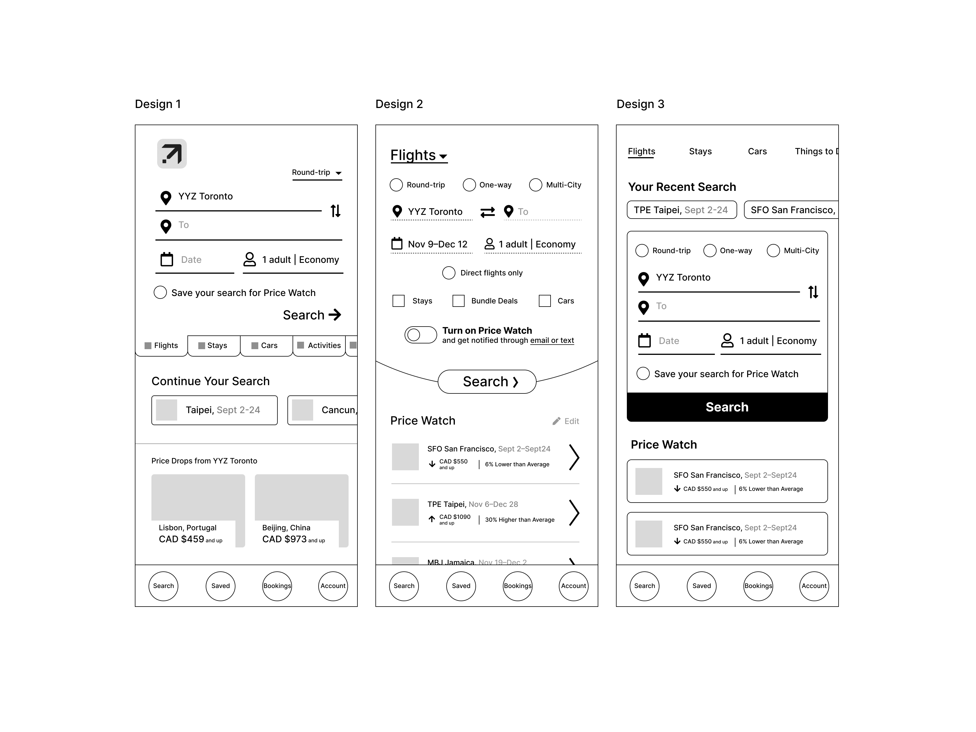
Low and Med Fidelity Wireframes
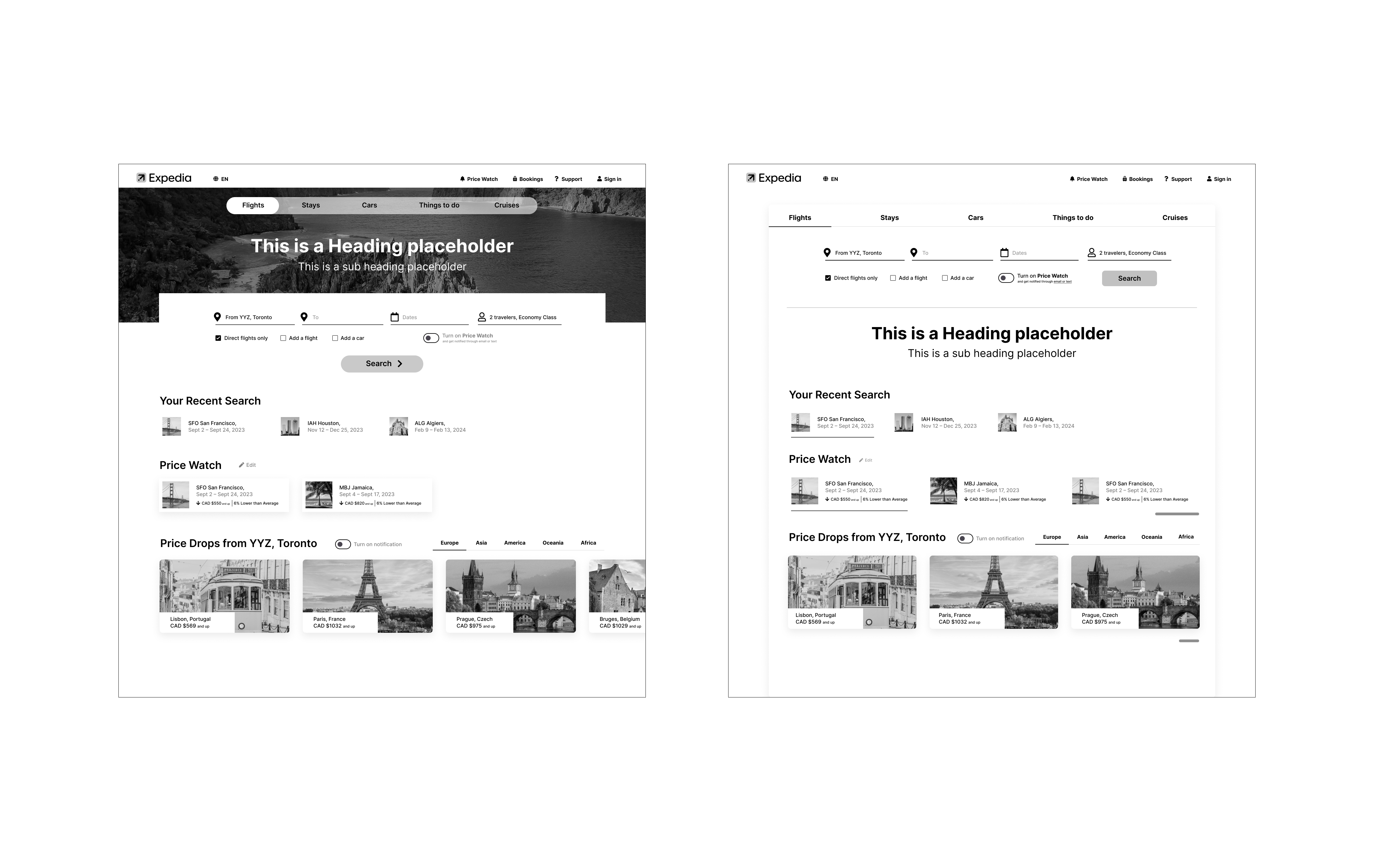
Expedia Homepage includes the main and most important user flow – the Search Tool which leads to booking completions.
I explored a few design layouts that are consolidated from my research results and thought-out insights.
Desktop
Unselected designs
Mobile
High Fidelity Wireframes (Work-in-progress)
Selected Works
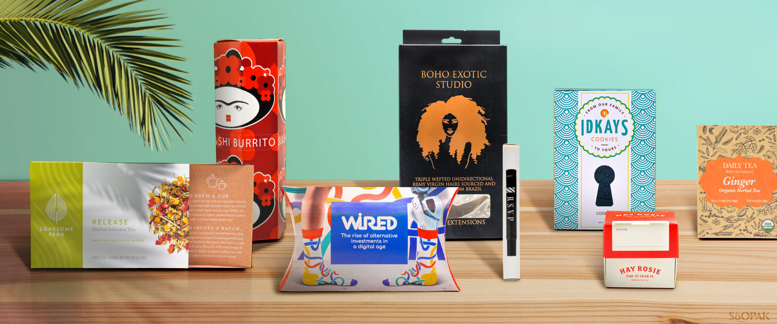
Digital & Print DesignProduction


Branding for T&T BakeryBranding
Elevating experience to increase completionUX UI Design
Who says work management tools are boring?UX UI Design
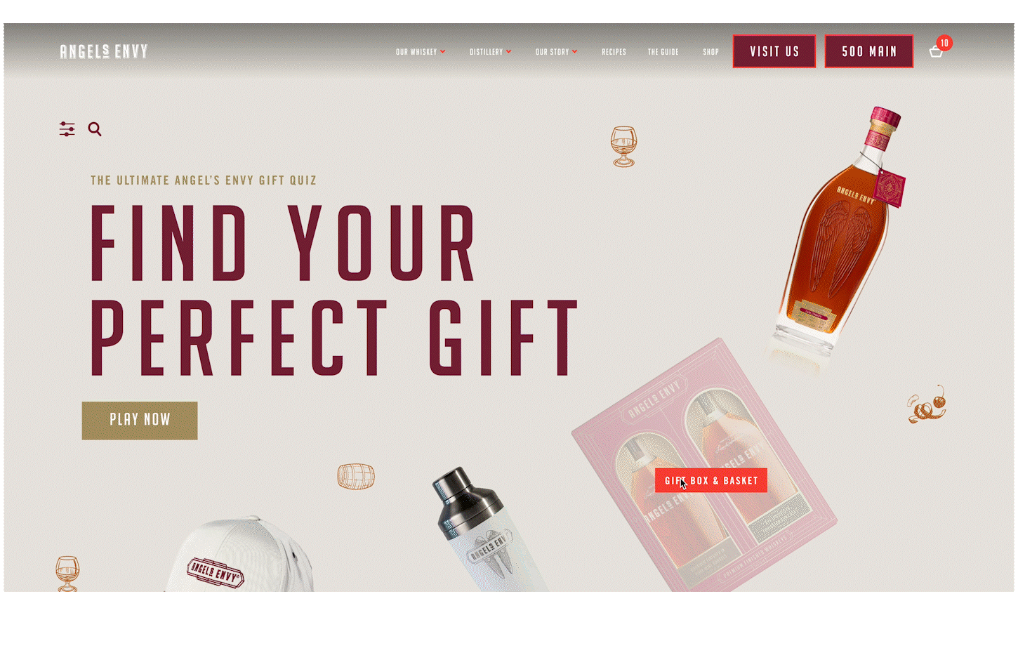
Gamifying gift guide to increase engagementUX UI Design
Creating community for e-commerceUX UI Design
Branding for Local CreaturesBranding
Shopper's Marketing for Campbell'sShopper's Marketing
© 2023. All Rights Reserved to Fen Hsu.