Monday.com Work Management Redesign
Challenge
< Personal project > Monday.com Work Management wants a new branding that stands out from its competitors and to attract new users.
Role Sole designer for UI/UX.
Work
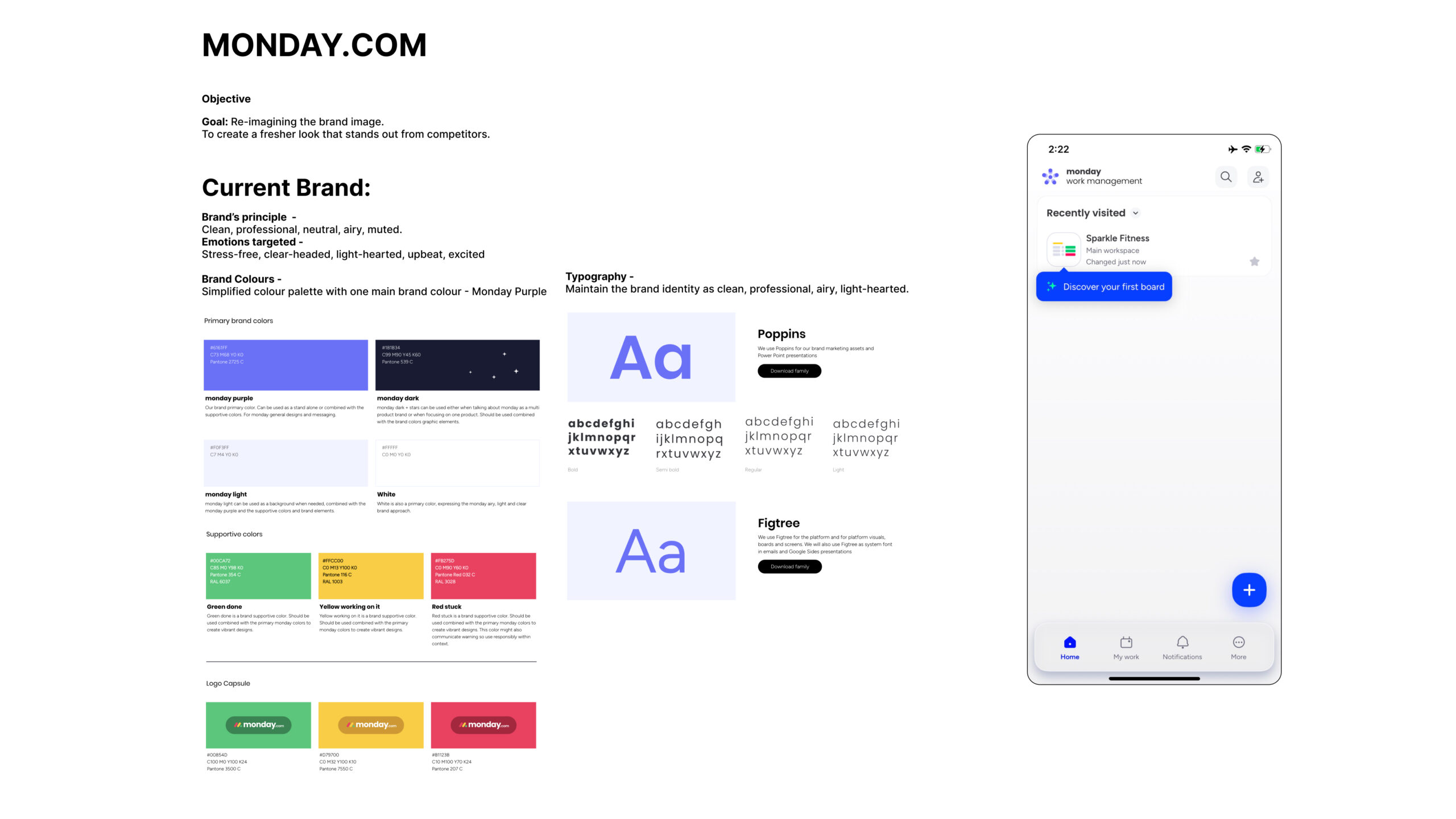
1. Branding
2. UI/UX design
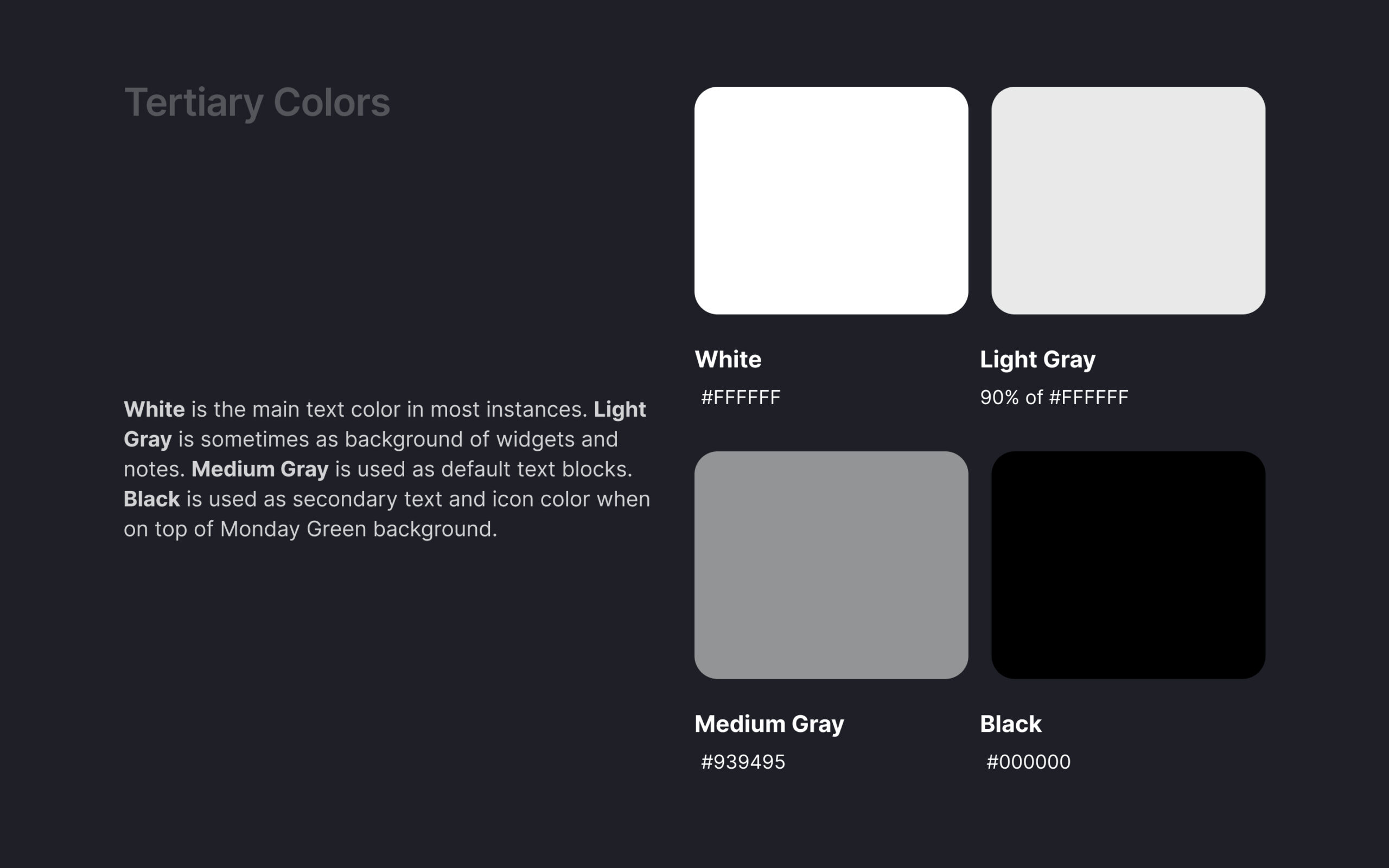
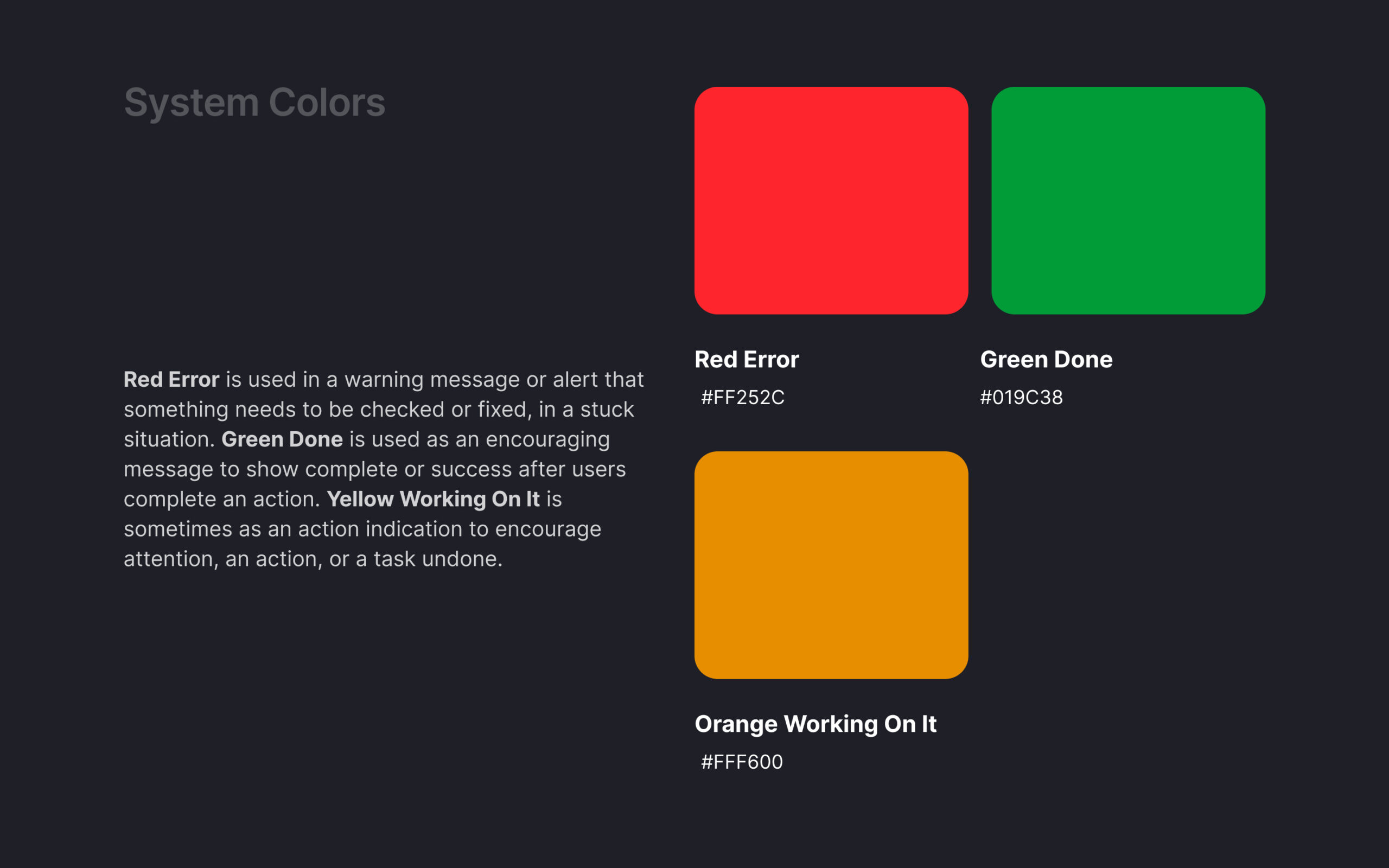
2. Colour system
3. User flow prototype - Change password
Tools
Figma
Illustrator
Photoshop
Premiere Pro
Solution
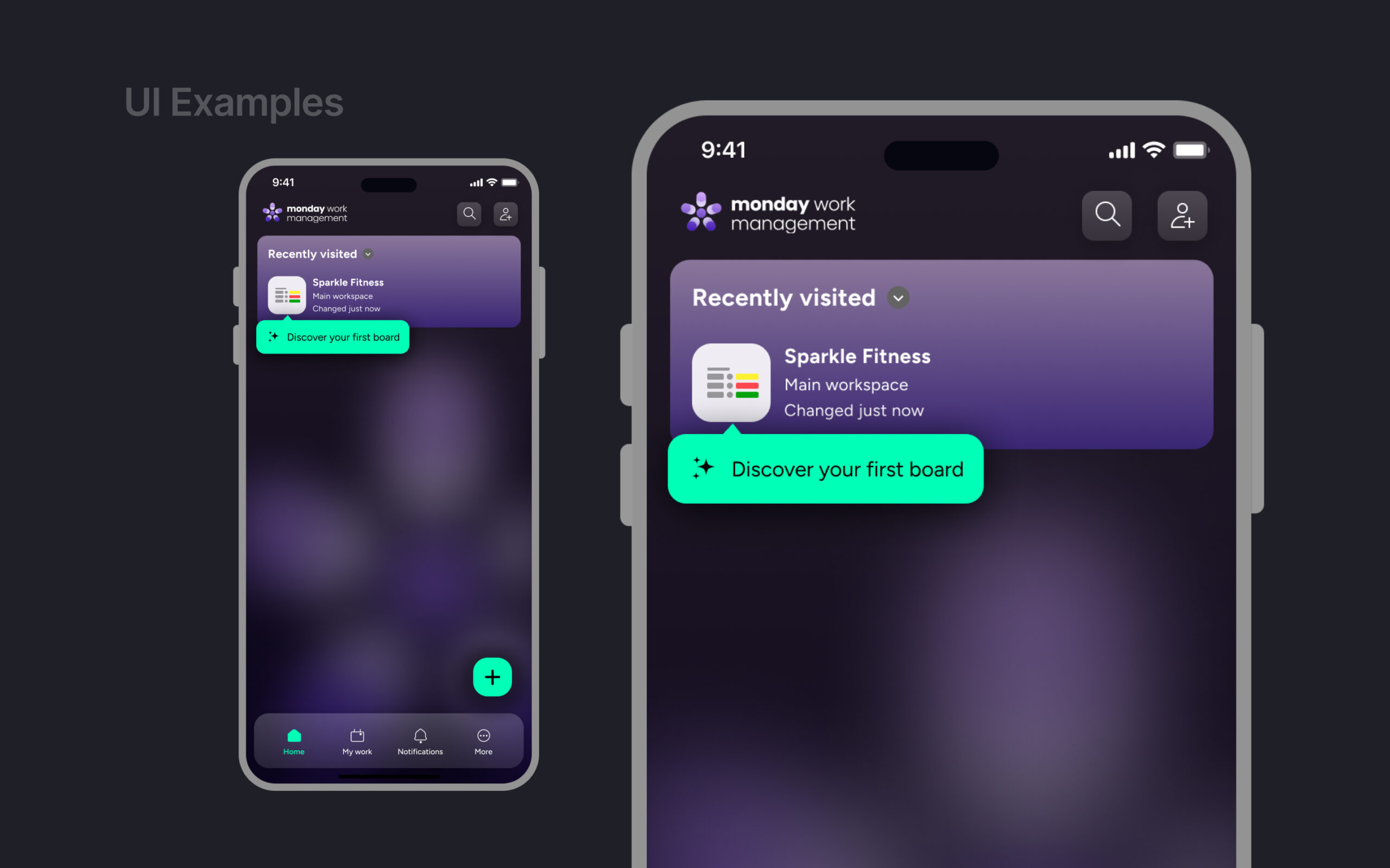
I want to change users' perception that "work management tools are always boring and predictable".
- New brand identity:
Monday colors are modern, fun, bold, and cool. Monday engages with the customers with its high-tech tools and services, while making it exciting and intense, just like playing video games. - Target audience:
- 22 to 40 year-old
- entrepreneurs, start-ups, young professionals
- current and new users - Brand’s principle -
Modern, fun, high-tech, cool. - Emotions targeted -
Intense, fun, excited, curious - Brand Colours -
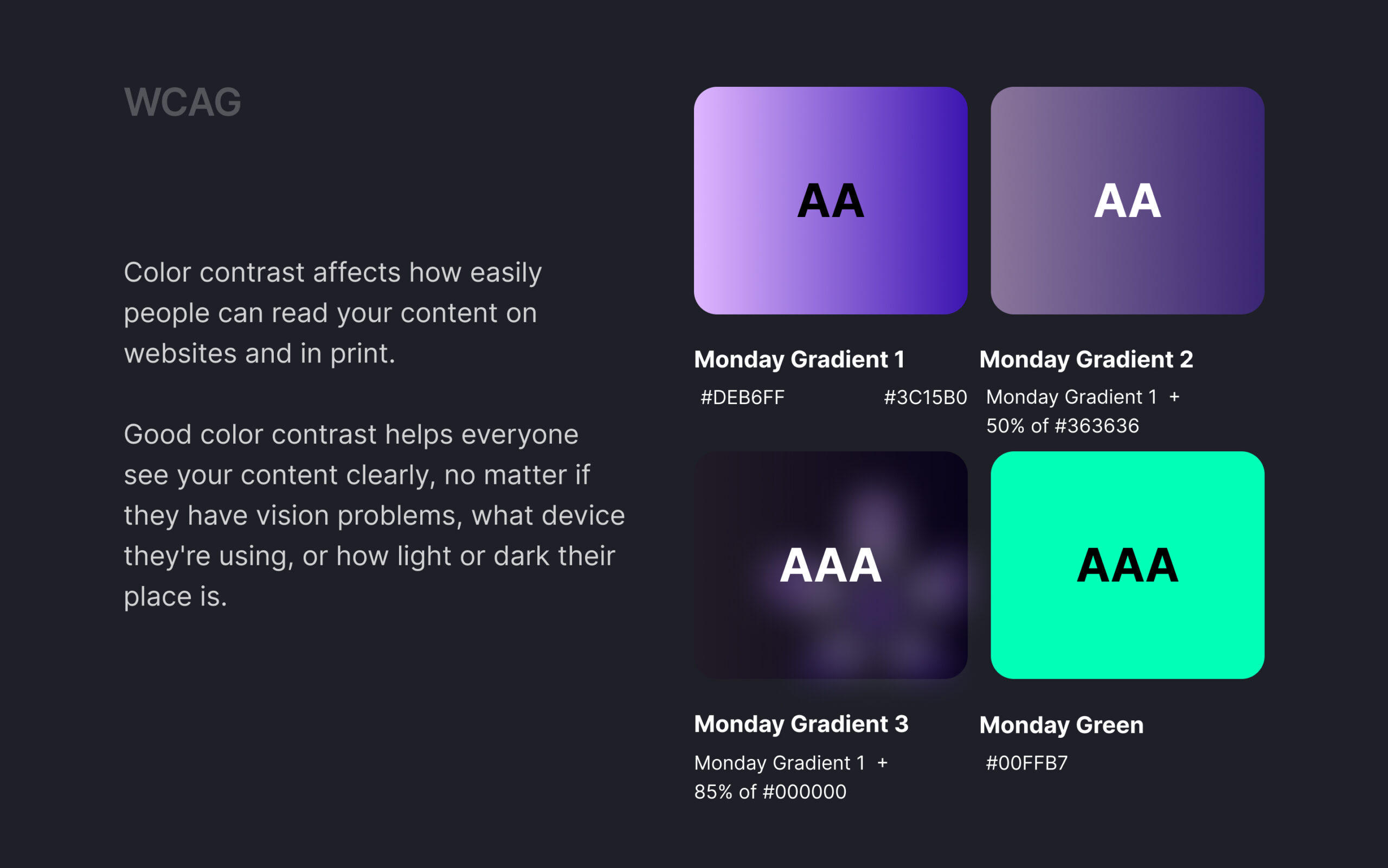
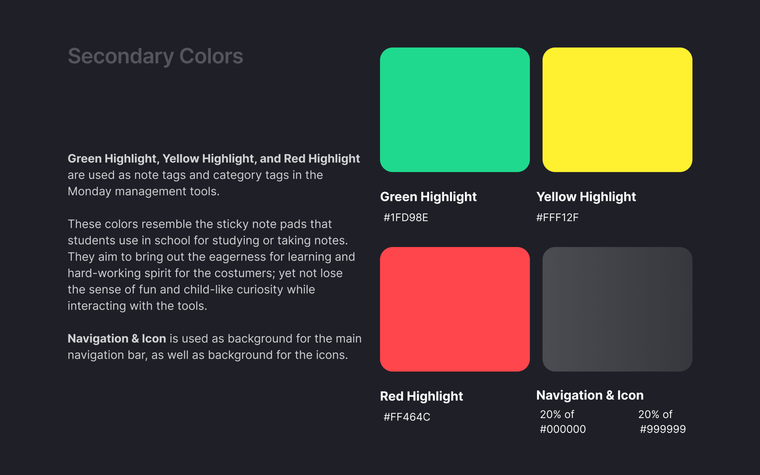
The new Monday Purple is a luxurious purple-tone gradient. Simplified colour palette.
Branding & UI Design
Work-in-progress Design Iterations and Notes
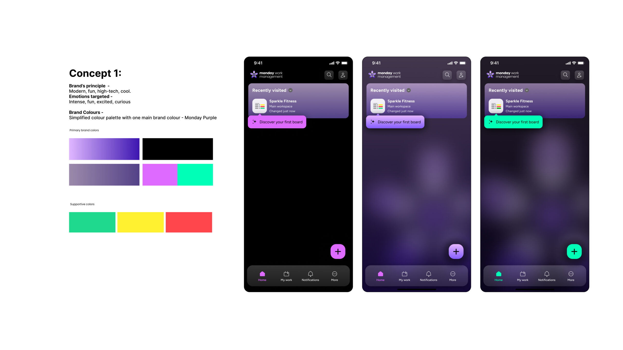
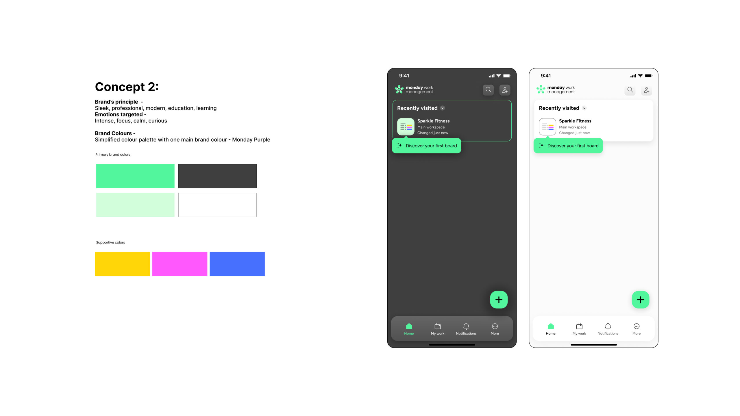
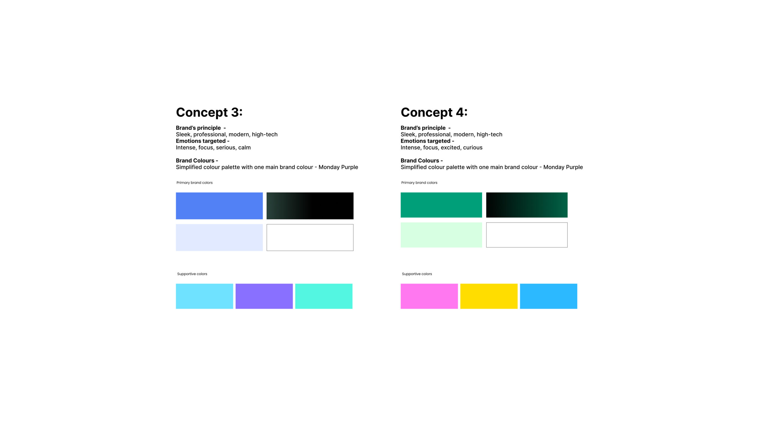
Colour System


UI Flow Prototype - Change Password
Selected Works
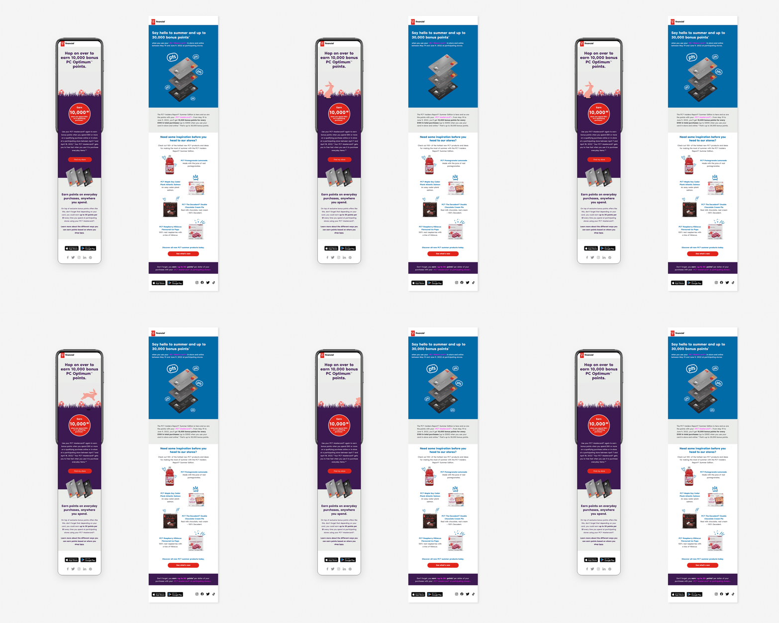
Digital & Print DesignProduction
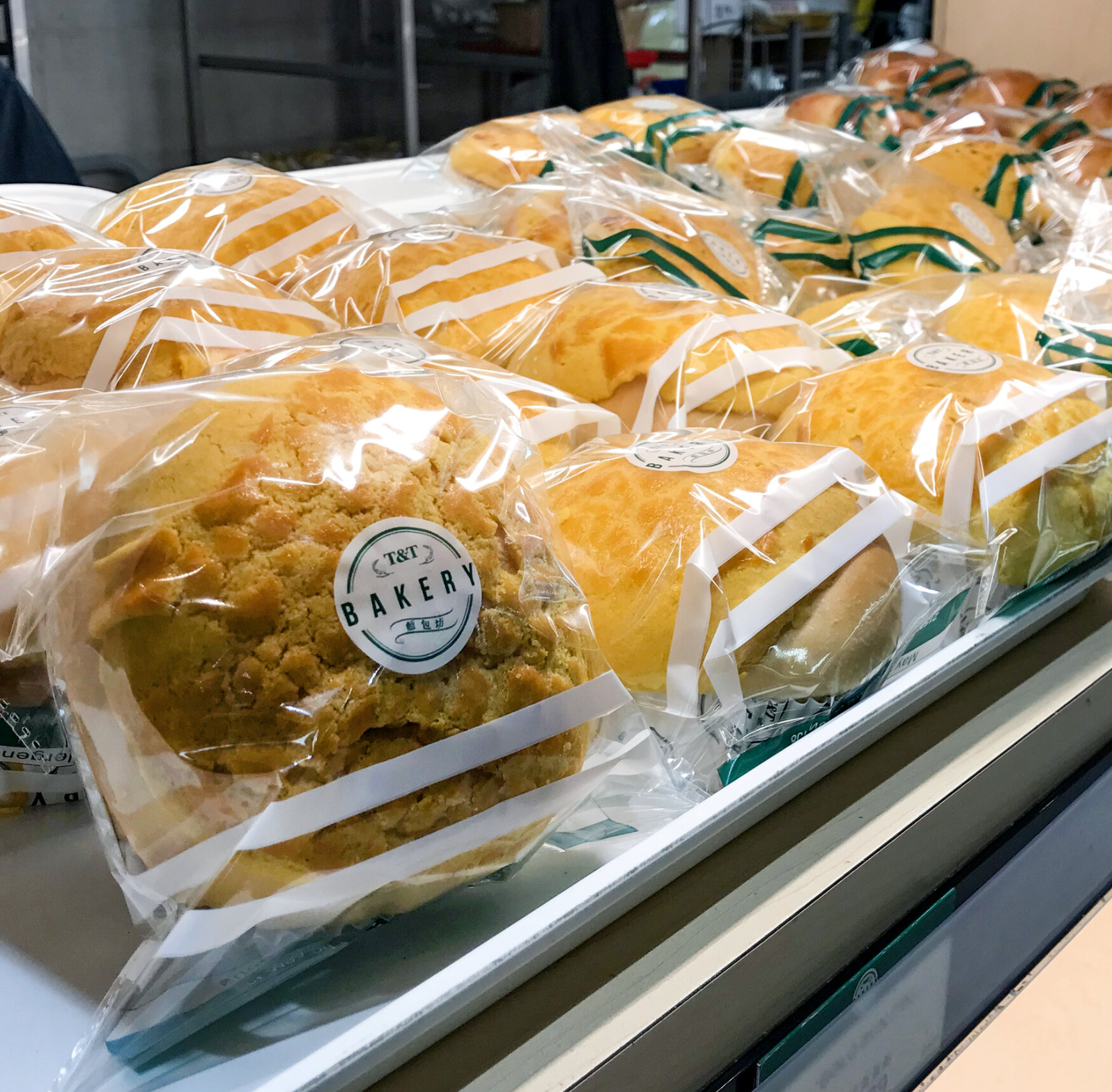
Branding for T&T BakeryBranding
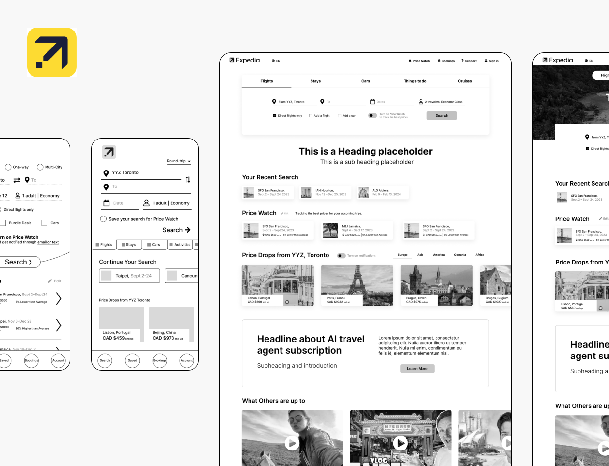
Elevating experience to increase completionUX UI Design

Who says work management tools are boring?UX UI Design
Gamifying gift guide to increase engagementUX UI Design
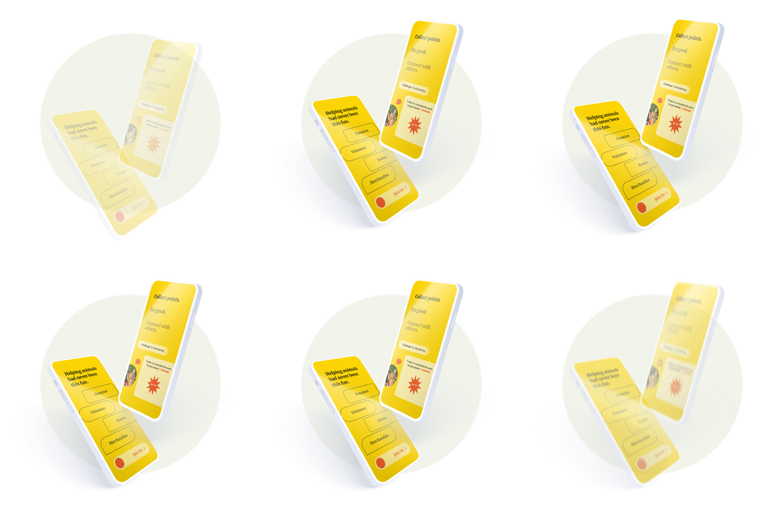
Creating community for e-commerceUX UI Design
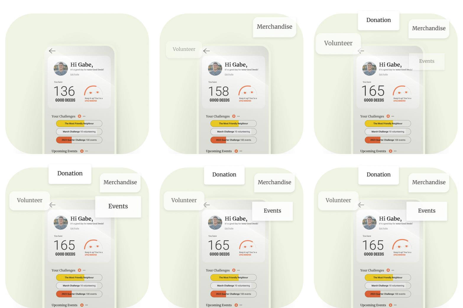
Branding for Local CreaturesBranding
Shopper's Marketing for Campbell'sShopper's Marketing
© 2023. All Rights Reserved to Fen Hsu.


